A task that I truly enjoy is developing logos. There is something magical and stimulating in abstracting a concept into visual elements and then putting them together to form a concrete and memorable icon.
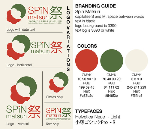
The Spin Matsuri logo started as a doodle in my sketchbook. I was contemplating the way hoops interact and drawing shapes based on their movement. I didn’t intend for this little sketch to become our logo, yet it fit just right. Depending on how you pull it apart, it has elements of connection between solitary and multiple circles, a sense of motion, a circle of hoopers, a Japanese flower motif, and even a moon. By coloring it with a traditional Japanese autumn palette, I put it in context with our October event.
The logo text was trickier. With round elements in the logo, I wanted to find a typeface that had rather circular curves – especially for the capital S . I searched high and low but souldn’t find what I wanted. I played with creating my own type for this logo, but my trials didn’t fare well. In the end, I opted for an old workhorse, Helvetica Neue, with a small modification to the i. It didn’t nail the look I was going for but it didn’t make me cringe, either. I count it an acceptable compromise.
So that is the story of our logo. I am happy with it and hope that it will capture people’s attention and help them fix Spin Matsuri in their minds.

